Housing bubble in the UK – part II
Earlier in the week, we looked at whether we may currently be in a housing bubble. The conclusion was that, in London, perhaps the 2007 bubble never burst, and that Londoners should be wary of further house price increases. In the North, however, house prices relative to inflation were still declining.
However, there was one metric I overlooked: the interest to income ratio. House price crashes are generally caused by lenders not being able to meet their mortgage repayments and defaulting on their loans. This was particularly prevalent in the sub-prime mortgage markets. However, a low interest to income ratio would imply that this type of widespread default is very unlikely.
The interest to income metric in 2013, as you can read below, implies that housing is at its most affordable level for 30 years, and therefore any talk of a “housing bubble” would be nonsense.
Interest to income ratio
House price data is taken from the Nationwide House Price Index, interest-rate data from the Bank of England and after-tax income data from the Office of National Statistics.
The most important metric, in my opinion, is the mortgage interest to income ratio. Although the whole mortgage repayment will be relevant for affordability, the capital repayment is an investment and therefore it is the interest-only part of the repayment which is the true “cost”.
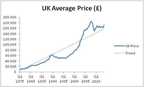
Before we look at the data, here is a quick reminder of what house prices have looked like since 1975:
For the interest-to-income ratio, we will look from 1986 onwards as this is the starting point for the salary information from the ONS.
The mortgage interest rate used is the BoE base rate + 2%.
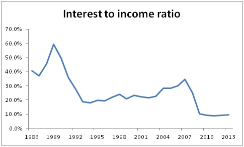
A VERY different story to house prices alone. Whereas house prices are generally increasing, the increase in salaries over the period combined with a general fall in interest rates has caused the interest to income ratio to plummet over the past 30 years.
This means that the money we are “throwing away” on interest as a percentage of our take home pay has never been lower. Mortgage interest has never been more affordable.
We can clearly see the two “house price crashes” in 1989 and 2007 caused by this figure becoming too high. It’s interesting that this “high” in 1989 was actually twice was it was in 2007. This could explain why house prices fell by 6.6% each year for 4 years between 1989 and 1992, but only fell by 5.2% for 1 year between 2007 and 2008.
Great news?
Yes, right now, I would argue it is.
The counter argument is that interest rates won’t stay this low forever. However, if they increased to a base rate of 4.0%, the interest-to-income ratio in 2013 would be 22.9%, which is only at the same level as it was in the 1990s. No bubble here!
What about affordability?
As all home owners will be more than aware, mortgage interest isn’t the only part of the payment leaving our bank accounts each month.
If we include the capital repayment into the equation, the total mortgage payment to income ratio is as follows:

We have a very similar pattern. The increase in house prices over the period against wages has not significantly altered to trend of the graph, and the 2013 position is still the lowest it has ever been.
Total average mortgage repayments (capital + interest) currently accounts for 31% of the average person’s salary in the UK. When we consider that many mortgages are paid by more than one salary contributor, this figure is very manageable.
Crazy time – 1989
My main observation here is how monstrously high this figure was in 1989. I’m going to have to ask my Mum and Dad how they managed when 80% of their take home pay was spent on their mortgage!
The same questions…
I will also answer the same questions as in the previous housing bubble post:
What is the long-term average?
Since 1986, the interest-to-income ratio has averaged 25.8%.
Since 1986, the mortgage-to-income ratio has averaged 44.8%.
What caused the 2007 “crash”?
In 2007, the interest-to-income ratio reached 34.5%.
In 2007, the mortgage-to-income ratio reached 60.7%.
What has the “recovery” looked like?
Since the lowest point in house prices (Q1 2009), the interest-to-income ratio has averaged just 9.4%.
Since the lowest point in house prices (Q1 2009), the mortgage-to-income ratio has averaged 30.7%.
Are we in a bubble?
No. In fact, quite the opposite. Mortgages (the ongoing cost of housing) are the most affordable they have been for 30 years. This may change if we suffer a sudden increase in interest rates. But surprisingly, despite the obsession with the lack of affordability of mortgages, things have never been better!
Hi, i am interested in re-creating this for myself, can you link me to the actual ONS page .. i have looked on there and found quite a few spreadsheets, just not sure which to use. thanks!