Housing bubble in the UK

The headlines from the media, political figures, banking leaders and other experts range from “The market is undervalued” to “we are coming out of recession” to “impending doom: bubble about to burst”.
However, I have not seen much data to date actually supporting any of these arguments.
Nationwide House Price Index
Each month, the Nationwide Building Society release figures on the state of the UK housing market in their House Price Index Series.
This looks at data going back historically to 1952, and detailed regional data back to 1973.
If you would like to know more about the series, please refer to the methodology and Q&A here.
All data in this analysis related to house prices has been taken from this series and data regarding UK incomes and inflation have been taken from the Office of National Statistics website.
The following analysis will look at a variety of aspects and attempt to answer 4 simple questions:
- What is the long-term average?
- What caused the 2007 “crash”?
- What has “recovery” looked like?
- Are we in a housing bubble?
UK house prices
Okay, let’s keep this simple at first. The following represents the average UK house price in each quarter since 1975, with a simple trend.
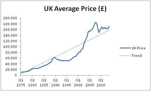
What is the long-term average?
Since 1975, house prices have increased, on average, by 7.5% per year.
What caused the 2007 “crash”?
For the 10 years leading up to the highs in Q3 2007, house prices increased by 11.7% per year.
What has the “recovery” looked like?
Since the lowest point (Q1 2009) house prices have increase by 2.8% per year.
In 2013, house prices in the UK have increased by 6.6% per year (pro rata).
Are we in a housing bubble?
It is hard to say. We are returning to the trend, but the “terrible crash” never actually took us below the long-term trend.
Oh dear. It looks like the bubble never burst. It just got a little smaller whilst the child retook their breath! However, this doesn’t tell the full story. We need to look at inflation adjusted figures.
UK house prices – inflation adjusted

What is the long-term inflation adjusted average?
Since 1975, house prices have increased, on average, by 1.9% per year above inflation.
What caused the “crash”?
For the 10 years leading to the highs in Q3 2007, house prices increased by 8.8% per year above inflation.
In nominal terms, this growth was only 4.2% above average. In real terms, it was 6.9% above average each year. This is where the problem truly lay.
What has the “recovery” looked like?
The word recovery comes into question here. Since the lowest point (Q1 2009) house prices have actually decreased by 0.9% per year compared to inflation.
However, in 2013 to date, house prices in the UK have increased by 3.8% per year above inflation (pro rata).
Are we in a housing bubble?
No. 2013 has been above the long-term average. But, inflation adjusted, we are still below the worst point in the “recession”. Furthermore, we are also behind long-term trends.
So, we are recovering, but the true house prices in comparison to inflation are actually coming down. Phew, there is nothing to worry about.
Not so fast!
It may not be the house price to expenses (which inflation essentially measures) that is the concern, but rather the house prices vs income.
UK house prices vs income
For each year since 1975, the following graph looks at the average house price as a multiple of the average household’s average tax income for the year (data taken from ONS).

What is the long-term average?
Since 1975, the average income multiple is 4.60.
What caused the “crash”?
In 2007, this soared to 6.55.
What has the “recovery” looked like?
Again. There hasn’t really been a “recovery”. In 2011, it reduced to the lowest level of 5.11.
Whilst this was a fall from the highs, it is still higher than 25 out of the 27 years before 2002.
Are we in a housing bubble?
Quite possibly. While this has become more manageable since 2007, it is still above historic figures and is about to exceed the long term trend again.
Additionally, the long-term trend, in my opinion, should be close to static. The fact it is going up was caused by the irresponsible lending and borrowing which caused the credit crunch in the first place.
My main worry is that help-to-buy can only increase this price to income multiple, and I fear that it will increase it rapidly.
Oh dear. Things maybe aren’t looking that rosy for the UK.
The UK – it’s a big place isn’t it? Many media outlets seem often to forget this.
UK house prices – The “North-South Divide”
The Nationwide data also provides regional house prices. To represent the North-South divide, I have used figures from the North compared to those from London. This is because when people say “North-South divide”, in my opinion they actually mean the North-London divide.
We will look at the inflation adjusted figures shortly, but first here is a simple indexed graph to show that, when it comes to house prices, the “North-South divide” is a real problem. And, it’s only getting bigger:
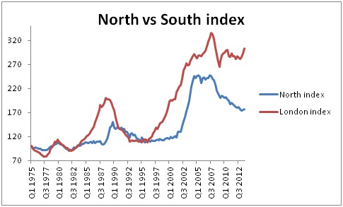
Until 1996, the two regions (despite some different paths) were still essentially at the same point. Over the following 10 years, they moved in the same direction, but with London moving much more quickly
However, in 2008/09, something very concerning happens. The regions start to move in opposite directions! This is probably how the Hunger Games happened, right?
Anyhow, I digress. Let’s get back to the question in hand…

What is the long-term average?
North – Since 1975, house prices have increased, on average, by 1.5% per year above inflation.
London – Since 1975, house prices have increased, on average, by 2.9% per year above inflation.
What caused the “crash”?
North – For the 10 years leading to the highs in Q3 2007, house prices increased by 8.1% per year above inflation.
London – For the 10 years leading to the highs in Q3 2007, house prices increased by 9.3% per year above inflation.
Everyone caused the crash!
What has the “recovery” looked like?
North – Since the lowest point (Q1 2009) house prices have decreased by 2.9% per year compared to inflation.
London – Since the lowest point (Q1 2009) house prices have increased by 2.2% per year compared to inflation.
So, whereas London is “recovering”, the North is actually falling further into recession!
North – In 2013, house prices in the UK have increased by 0.4% per year above inflation (pro rata).
London – In 2013, house prices in the UK have increased by 11.0% per year above inflation (pro rata).
In 2013, the North is just keeping itself above water. London, on the other hand, is booming.
Are we in a housing bubble?
North – Absolutely not. 2013 has been below the long-term average and, inflation adjusted, we are still far below the “worst point” in the recession!!
London – Quite possibly. 2013 has been way above the long-term average and more importantly, it is above those figures that caused the 2007 crash.
Londoners: get your raincoats on and take cover!
This is a really solid analysis. London seems like such a hot real estate market. It’s incredible what little space you get in London for fairly sizable rents. I was watching house hunters international and this one couple got what looked like a closet of a studio apartment for what you could get a pretty big studio here in Minneapolis/St. Paul, MN. And that’s not saying MPLS/ST. Paul isn’t hot – rents here are really high.
It’s always interesting to see real estate in other markets. Thanks for the run down.
Great article! Things are really starting to go crazy in London since you wrote this article as well… I can’t help but think London at least is travelling head first into another bubble! I have a few friends that have sold property in the last couple of months and are moving out of London, and they have absolutely cashed in over the space of 3-4 years of buying and holding those properties.
Very good article. London is indeed becoming a different place. Did you by chance catch “mind the gap” on iPlayer, talking about cities.
But I wonder if there’s a macro trend arching above us. At some point people will realise that paying stupid amounts of money just to be in the capital won’t work any more so we’ll see more drift.